

Have you ever looked at a business card up close? The business logo, the brand name in bold fonts, the contact details and social media handles. Everything is strategically placed in ideal spots. Important elements are highlighted and bigger while the rest are small though still readable.
This is what we call – The Small Space Magic, where a graphic designer or an illustrator makes the most of the compact areas with smart designs. You can think of it as a painter with a small 4×4 inches canvas. It would be very difficult to fit in an intricate pattern with such space limitations however, with the employment of the right tools and skills anything is possible!
So, let us learn together about the five cool strategies that are useful for effective designing in tiny but mighty areas.
Weaving Design Creativity in Compact Spaces
Importance of Space in Graphic Designing
Designing material of any size is a highly creative ideation task, let alone the ones where the space is smaller than usual. For example, in leaflets, brochures, logos and business cards. Designing becomes an extended nail-biting challenge where the creators must maximize the impact within confined limits.
It requires innovative thinking, strategic space usage and a keen eye for detail to ensure that the message is clear and still engaging. In a nutshell, leaflets and flyers Designers must think out of the box to make every project functional and visually attractive. It is important because, otherwise the target audience will never be able to receive a strong and concise message.
Therefore, the creators have to be trained to strip away extraneous elements and alienate the significant particulars only. Moreover, once a minimalist illustration is ready, it gives a sophisticated and elegant look, navigating the attention of the audience on the most important elements like brand name, logo, facilities available, contact number and official timings.
#1 – Use the Negative Space
A negative space relates to the vacant or blank parts in a design, which are highly significant to engage the consumer effectively. It is the gaps between text lines, gaps in illustration and the empty webpage margins. The negative spaces are rather opportunities for the smart designer to bring in his creativity.
These blank zones can be filled with colours, patterns and textures. Doing this will highlight the content elements making them more attractive and readable. Moreover, this trick is perfect for capturing attention instantly, leading the user to all key elements of the content, even when the text is lengthy. Here is a demonstrative example where negative space is cleverly utilized.
#2 – Manage Visual Hierarchy
When the illustrator organizes all the components to guide the viewer’s attention in a deliberate order, it is the management of visual hierarchy. Every logo design company has to incorporate this principle in their projects for a more intuitive and enjoyable user experience.
Such as in the image above. The creator followed the simple rule that the user’s vision path focuses initially on the larger components. On the other hand, they could benefit from the fact that eyes move from the brightest colours towards the mute. Using repetitive styles to build a connection is also a trick of this principle.
#3 – Add in Modular Layouts
The third principle of small space magic is all about dividing a design into smaller, manageable sections and modules. Each section has its texts, images, and graphics arranged in a grid form. This has numerous upsides like bringing flexibility, consistency and maximizing space efficiency in the overall design. Below are a few sample grids.
They come in handy when there is a greater amount of content and a compact area to fit everything. Modular layouts not only save your time but also ensure the standardisation of the theme, visual harmony and functionality of the design.
#4 – Choose Typography with Care
Before picking a font style and size for the graphic designing project, you must take into consideration the following aspects:
- The Scope: Is the design for digital or print media? What are the requirements?
- The Mood & Tone: The typeface must align with the vibe and convey the right message.
- The Versatility: Pick a font style that is flexible in both media formats.
- The Compatibility: Each element of the layout needs to complement one another.
- Functionality: Mix and match different font sizes for different contexts for readability.
#5 – Scalable Vector Graphics
Also known as SVGs, these are customary industry standards for images in web designing. They are crucial because of their resolution independence, which helps in resizing visual designs like icons, logos, charts and other illustrations without losing quality. You must have come across such an example on web pages where the huge text grows smaller as you scroll down.
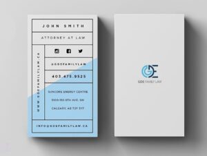
Interactive and animated designs like these attract the user’s concentration to the site. However, it is not only for digital media. In print media also, if the logo of the company is not in SVG format then resizing can lead to a blurred image in the business card or leaflets such as in the image below.
Final Checklist for Your Small Space, Smart Design
- Is it minimal?
- Is the typography strategic?
- Are images high quality?
- Is the CTA clear?
- Negative spaces included.
- Are there bright colours?
- Are there modular layouts?
- Is everything readable?
- Well-balanced hierarchy?
Q. What tools are best for designing in small spaces?
You may use tools like Adobe Illustrator, Adobe XD, Canva, Procreate, Figma or Sketch to create detailed and scalable designs, which are appropriate for small spaces.
Q. How can I make my small space design stand out?
By simply focusing on simplicity and clarity, you can make the most out of a compact space. Other than that, you will need bold colours, strong typography and strategic placement of content elements for an effective proposition.
Q. What are some common mistakes to avoid?
You should never clutter the project with too many components (icons and other illustrations). Using overly complex fonts can destroy the balance of the design.
Q. How can I test the effectiveness of my designs?
To test the effectiveness, you must conduct tests and gather the feedback of the users to understand their thoughts about the proposition. See how well they understood the message you wanted to deliver and you will have a clear picture of the effectiveness.
The Final Words
So far, we have learnt that no matter how small the space is, there are two rules for designing smart. Rule no one – every element of the content needs to be readable and scalable. Rule no two – there is always room for creativity even where the space is compact.
You can use the above-mentioned five tricks to make sure no boundaries can limit imagination. A simple explanation is writing the word ‘the’ on the curve of the ‘O’ for the brand named The Orchids. You could have done it by reducing the font size, altering typography, reorganising the visual hierarchy and making all these components in SVG format. So, are you ready?